

When longtime partners of Brandiose, Minor League Baseball’s Tulsa Drillers, called and told us they were bringing professional soccer to Tulsa we got excited. When they asked us to brand the club, we immediately thought of all the amazing Oklahoma imagery that we didn't get to use when we rebranded the Drillers 15 years prior. We also understood that they’d find a lot of success. Not only do they know how to run a sports franchise, but the USL schedule dovetails perfectly with a MiLB season.


With our first round of sketching, we explored all the oil tower and wildcatter imagery that we had uncovered on our first research visit to Tulsa. We also really loved the story that striking oil is like finding gold and that finding one drop of oil is almost like finding a gold nugget. It means that you could be standing on a sea of oil and wealth that could instantly change your life forever.
Ultimately, the brand needed to reflect the name “Roughnecks”. We felt inspired to pay homage to the workers that put their lives on the line in the blazing Oklahoma sun to bring this valuable commodity to market.
At Brandiose, we never nickel-and-dime. We don’t stop until you are 100% thrilled with results. If that means you want to see 24 different shield shapes, then so be it. We’ll never issue a change order because we share your passion and we want to bring the best design possible to your fans.
The final identity embraces the power and heroism of the oil tower with a simple heroic composition. Rivets, a clean shield silhouette, and a bold color scheme round out the Club’s crest. The alternate mark adds a human dimension to the identity and offers fans an alternate merchandising option.
We love how soccer supporters truly steer the Club’s brand and fan experience. By adding local Tulsa landmark, the Golden Driller, to the Roughneck’s scarf the club has given supporters a true symbol of their local pride and passion.
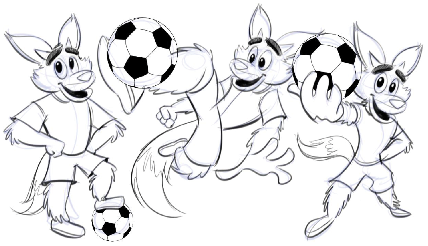
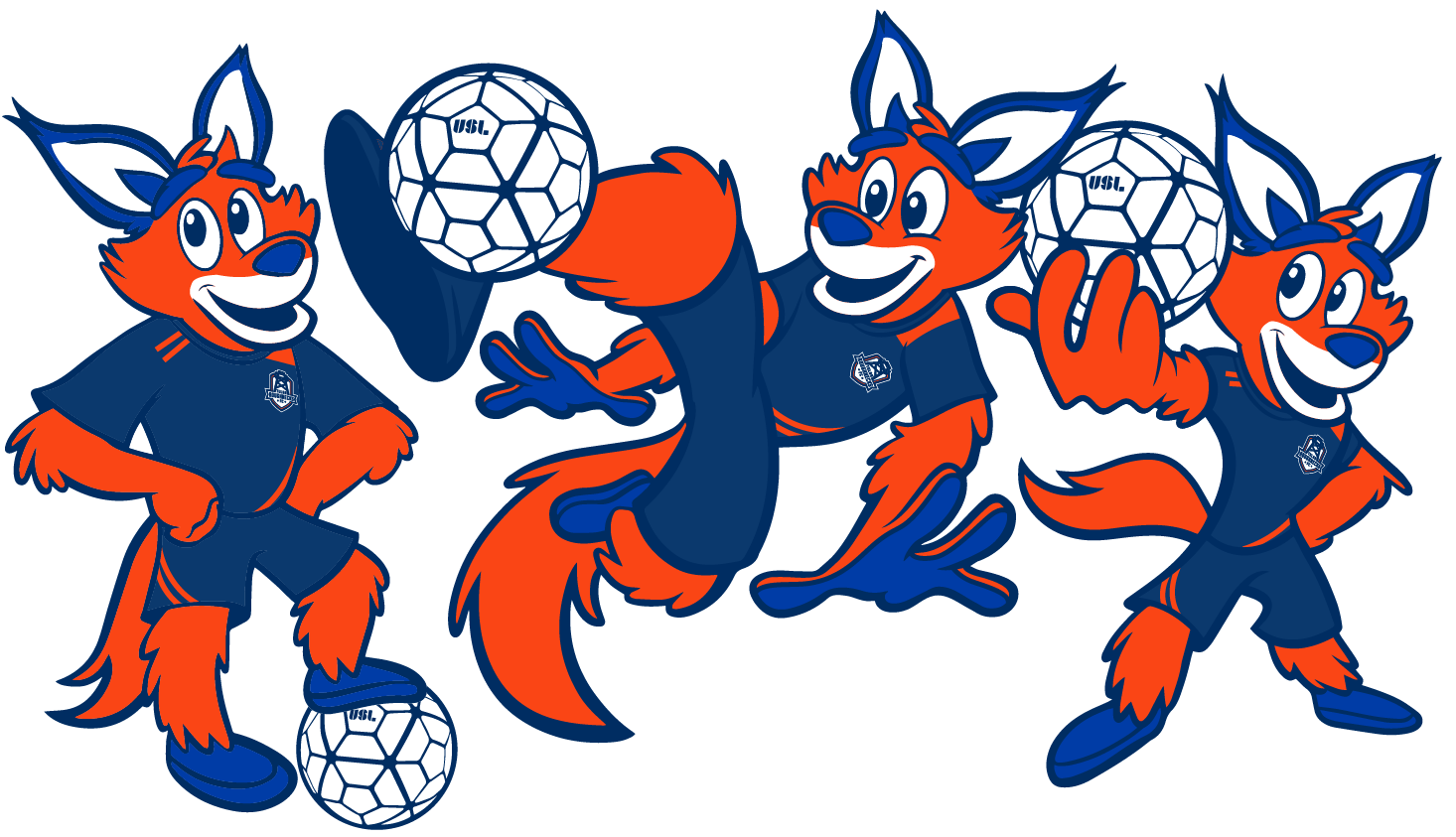
Mascots are any sports franchise's best ambassador. A soccer mascot has the additional challenge of needing to be athletic on the field but also approachable in the stands. For the Roughnecks, we wanted to design a character that symbolized the scrappy and energetic on-field action, so a coyote was the obvious choice.
And just like our identity process, mascot design begins with pencil sketches and is then taken into the computer to be brought to life.

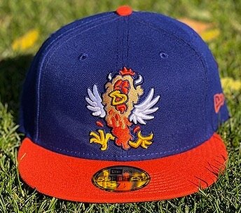
*tap a hat to see more